
B2B founders, listen up! Your homepage is your digital handshake.
It needs to:
→ Grab attention
→ Build trust
→ Drive action
Sounds simple, right? But how do you achieve it? Let’s dissect the homepages of 6 B2B SaaS giants: Deel, Webflow, Notion, Attentive, ClickUp, and Wiz.
We’ll break down each company’s main message, headings, content structure, and CTAs to see what they do well and learn from their inbound marketing strategies.
Ready to kick things off? Let’s dive in!
Deel
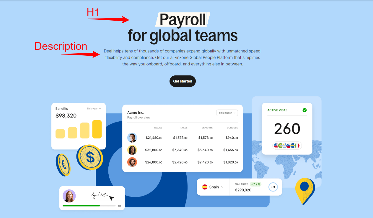
H1: Payroll for global teams
Description: Deel helps tens of thousands of companies expand globally with unmatched speed, flexibility, and compliance. Get our all-in-one Global People Platform that simplifies the way you onboard, offboard, and everything else in between.
CTAs:
- Get started
- Request a demo
- Learn more
- Read customer story
Homepage Content Structure:
- Introduction: Highlights Deel’s ability to support global expansion with speed and compliance.
- Why Choose Deel: Uses testimonials from real users to build credibility and trust. It highlights the problems Deel solves and the benefits users have experienced.
- Key Features: Global Payroll, Contractor Management, Equity Management, HR Operations, Performance Tools, Immigration Support, Compliance Hub.
- The Deel Advantage: Details benefits such as powerful reporting, scalability, dedicated support, and security.
- Global Coverage: Emphasizes extensive support and coverage, with specific numbers to back up claims.
- Customer Stories: Real-life examples of how Deel has helped other companies.
- Getting Started: Simplified onboarding process in three steps.
Additional Analysis Points:
- Testimonial Use: Deel leverages customer testimonials extensively to build trust and demonstrate real-world effectiveness.
- Comprehensive Coverage: The platform’s capabilities are clearly outlined, addressing common concerns related to global operations.
- Visual Hierarchy: Effective use of bold headings and structured sections make the content easy to navigate.
Webflow
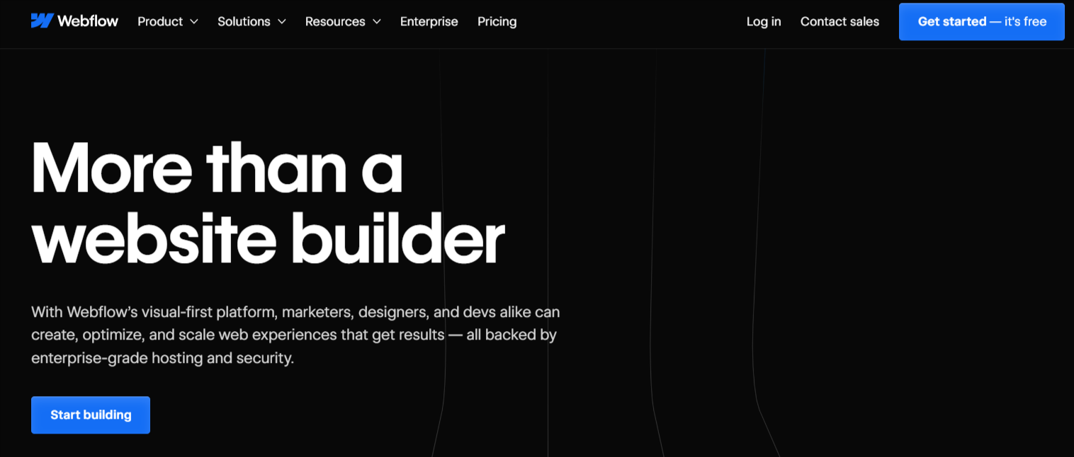
H1: More than a website builder
Description: With Webflow’s visual-first platform, marketers, designers, and devs alike can create, optimize, and scale web experiences that get results — all backed by enterprise-grade hosting and security.
CTAs:
- Start building
- Get started — it’s free
- Learn more
Content Structure:
- Introduction: Presents Webflow as a powerful tool for creating and optimizing web experiences.
- Creative Power: Highlights the design flexibility and coding capabilities.
- Customer Trust: Lists recognizable brands that use Webflow, providing social proof. Logos of Discord, Monday.com, TED, Dropbox, and others are prominently displayed.
- Growth Tools: Describes features that support business growth.
- Webflow Apps: Details integration options with other tools.
- Collaboration Features: Showcases tools that enhance teamwork and collaboration.
- SEO Optimization: Explains built-in SEO tools and features.
- Localization: Highlights capabilities for creating localized experiences.
- Enterprise Solutions: Details tailored solutions for large teams.
- Resources: Provides links to educational materials and customer success stories.
- Getting Started: Encourages users to try Webflow with a free starter plan.
Additional Analysis Points:
- Visual Emphasis: The homepage’s design showcases Webflow’s capabilities, acting as a live demonstration of what can be achieved.
- Customer Success: High-profile testimonials add credibility and demonstrate the platform’s impact.
- Educational Resources: Extensive resources help new users learn and succeed with the platform.
Webflow’s approach effectively combines visually engaging design with detailed information about its features and benefits, making it clear why businesses should consider their platform for creating, optimizing, and scaling web experiences.
Notion
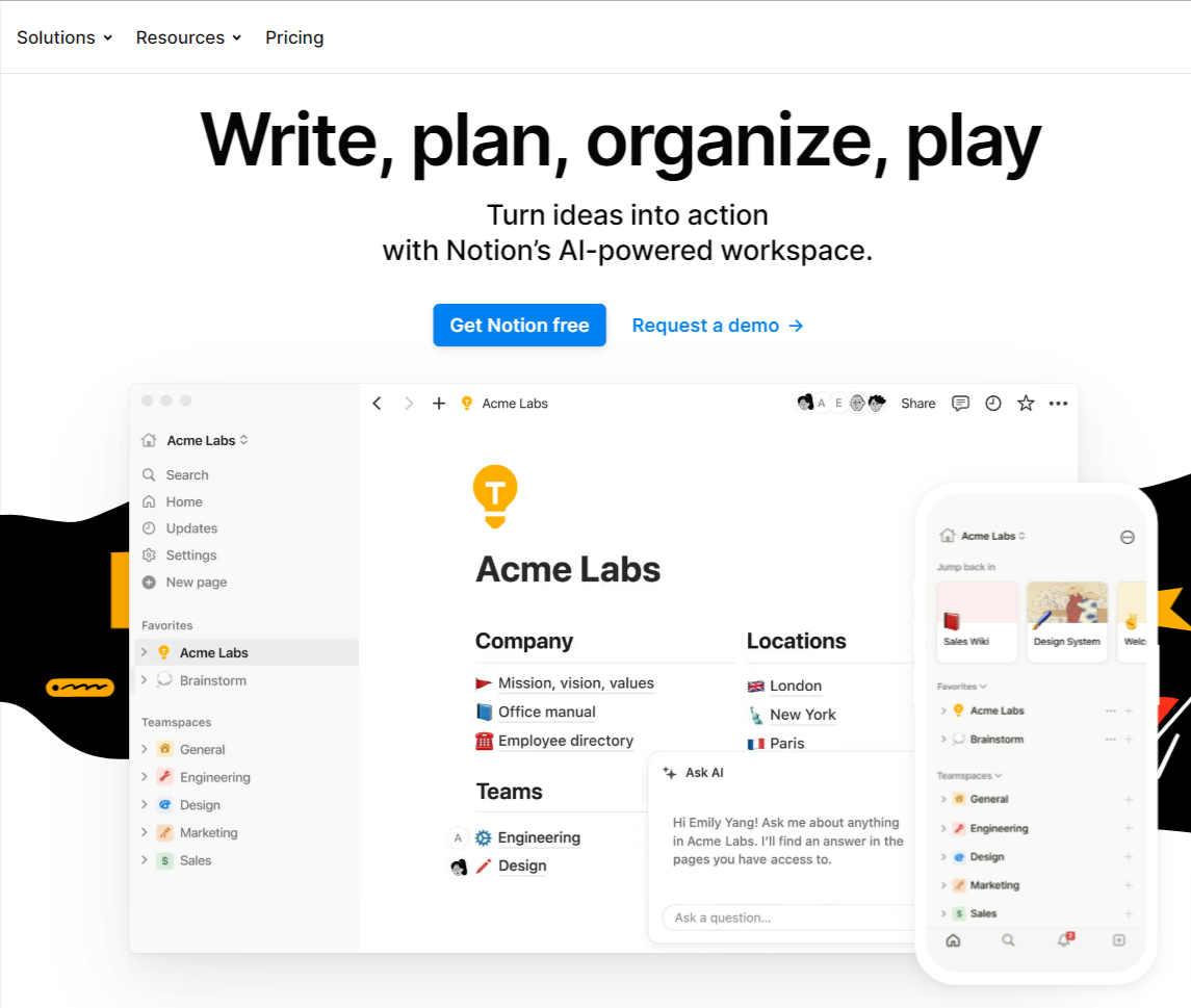
H1: Write, plan, organize, play
Description: Turn ideas into action with Notion’s AI-powered workspace.
CTAs:
- Get Notion free
- Request a demo
- Learn more
- Get template
Homepage Content Structure:
- Introduction: Establishes Notion as a comprehensive AI-powered workspace.
- Core Features: Highlights main features like Docs, Wikis, Projects, Calendar, and Sites.
- Customer Trust: Uses testimonials and user stories from well-known companies.
- Powerful Building Blocks: Explains customization and flexibility features.
- Community and Support: Emphasizes the active community and support network.
- Templates: Lists various templates available for different use cases.
- Getting Started: Encourages users to try Notion for free.
Additional Analysis Points:
- Community Focus: Strong emphasis on community and user-generated content, fostering a sense of belonging.
- Flexibility and Customization: Highlights the platform’s adaptability to various needs, making it attractive for diverse teams.
- AI Integration: Emphasizes the AI capabilities as a key differentiator.
Attentive
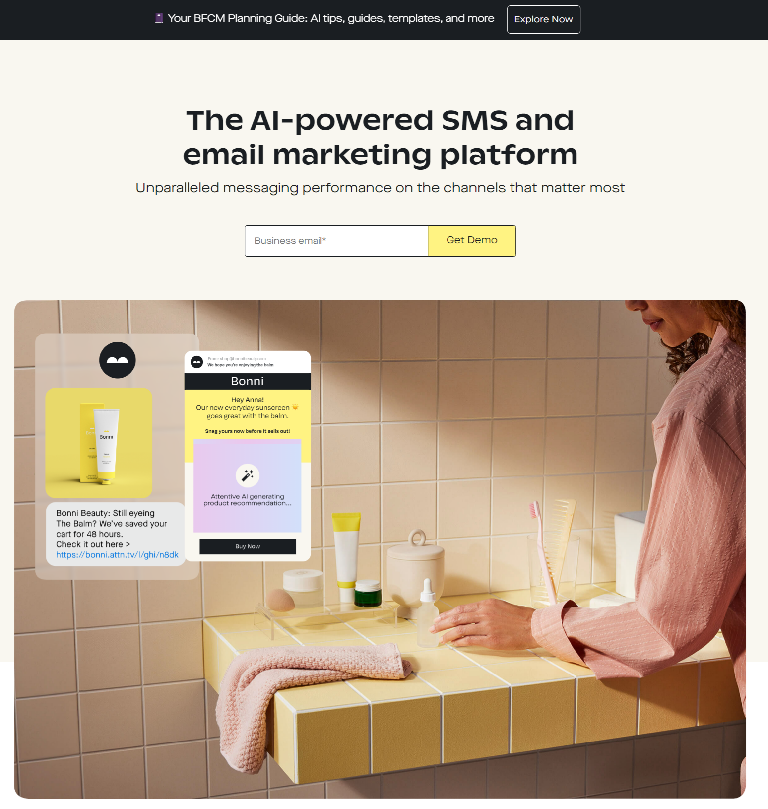
Attentive highlights its services by focusing on AI-driven personalization and performance. The homepage uses bold statements to emphasize its unique selling points, such as unparalleled messaging performance. It explains how the platform helps in acquiring new customers, building targeted audiences, and automating personalized messages. The structure includes clear sections on subscriber acquisition, audience building, and data integration, each with supporting details. CTAs like “Learn more” guide users to deeper engagement with the content.
H1: The AI-powered SMS and email marketing platform
H2: Unparalleled messaging performance on the channels that matter most
- H1 Analysis: “The AI-powered SMS and email marketing platform” clearly states the primary function and key feature (AI-powered) of the platform.
- H2 Analysis: “Unparalleled messaging performance on the channels that matter most” emphasizes the platform’s effectiveness and focus on critical communication channels.
Content Structure:
- Introduction: Highlights the platform’s AI-driven personalization and performance.
- Subscriber Acquisition: Describes tools for collecting subscribers.
- Audience Building: Explains AI-powered audience segmentation and targeting.
- Customized Experiences: Details automated, personalized messaging capabilities.
- Data Integration: Describes integration options with other marketing tools.
- Customer Success: Links to blog and customer success stories.
- Getting Started: Encourages learning more about the platform.
CTAs:
- Learn more
- Read the Blog
Additional Analysis Points:
- Focus on AI: The emphasis on AI capabilities highlights advanced personalization and performance benefits.
- Customer Data Integration: Showcases the ability to integrate with various marketing tools, enhancing workflow.
- Performance Metrics: Stresses high-performance messaging and results, appealing to data-driven decision-makers.
ClickUp
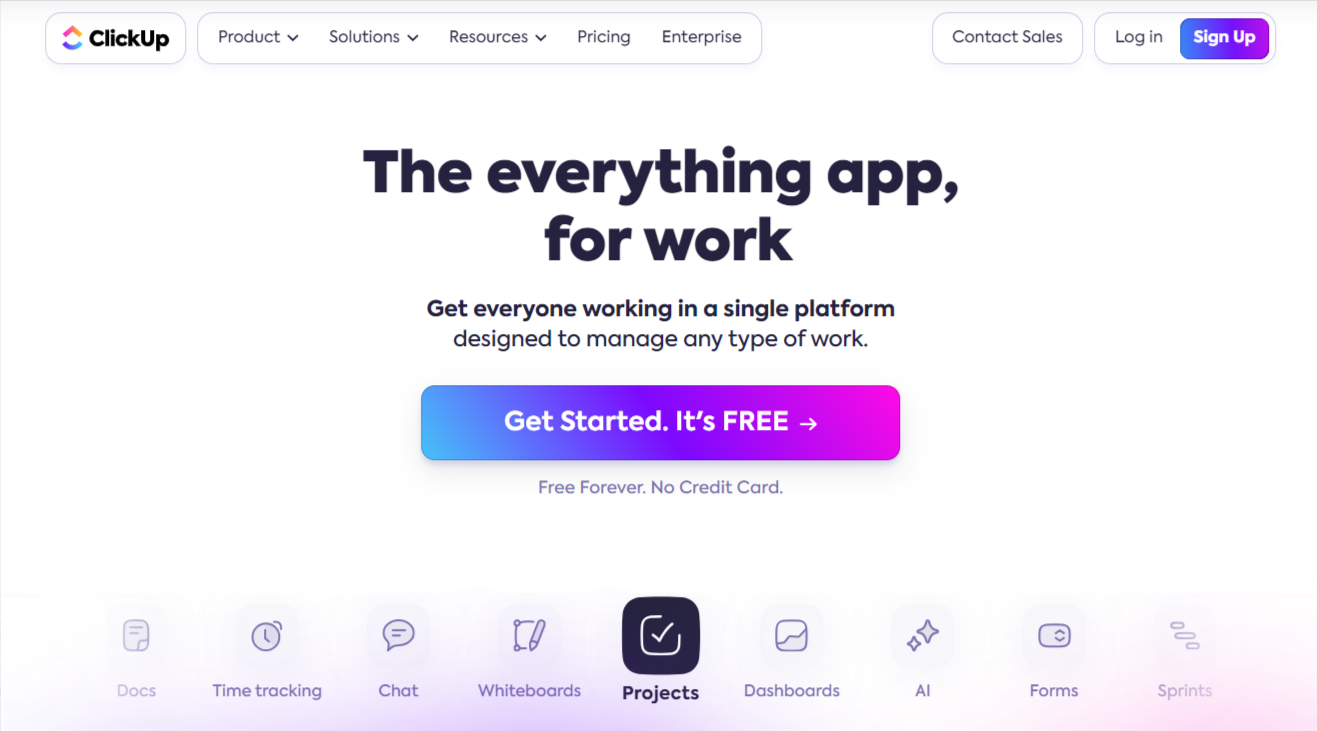
ClickUp’s homepage highlights its product as an all-encompassing work management platform. The headline immediately communicates the idea of a comprehensive solution. The page is structured to show the range of features such as projects, dashboards, AI, forms, and time tracking. Customer testimonials and usage statistics provide social proof. The CTAs like “Get Started. It’s FREE” and “Try for free” are designed to encourage users to start using the platform with minimal friction.
H1: The everything app for work
H2: Get everyone working in a single platform designed to manage any type of work.
- H1 Analysis: “The everything app for work” positions ClickUp as a comprehensive solution for all work-related tasks.
- H2 Analysis: “Get everyone working in a single platform designed to manage any type of work” emphasizes collaboration and versatility, addressing a broad range of work management needs.
Content Structure:
- Introduction: Presents ClickUp as an all-encompassing work management platform.
- Key Features: Lists features like projects, dashboards, AI, forms, sprints, docs, time tracking, chat, and whiteboards.
- Productivity and Collaboration: Highlights tools that enhance productivity and teamwork.
- AI Integration: Describes AI-powered productivity features.
- Flexibility: Emphasizes the platform’s customization and flexibility.
- Team Solutions: Provides tailored solutions for different teams.
- Customer Trust: Lists impressive usage statistics and testimonials.
- Getting Started: Promotes free trial and easy onboarding.
CTAs:
- Get Started. It’s FREE
- Try for free
- Learn more
- Use this Solution
Additional Analysis Points:
- Comprehensive Solution: Positions itself as an all-in-one platform, making it appealing to those looking to consolidate tools.
- AI and Automation: Emphasizes AI and automation to enhance productivity.
- Flexibility and Customization: Highlights the ability to tailor the platform to various team needs, enhancing appeal.
Wiz
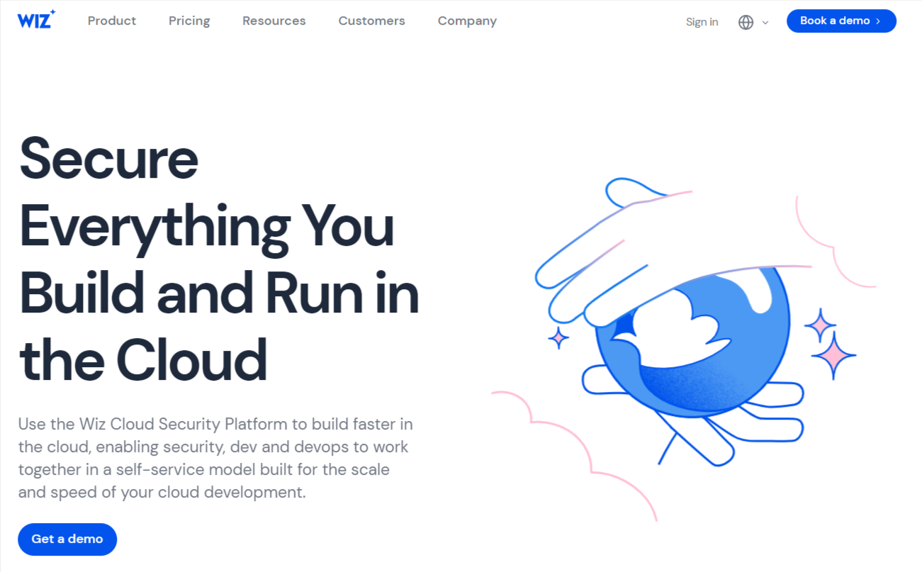
Wiz highlights its products and services by focusing on the comprehensive nature and integration of its cloud security solutions. The homepage effectively uses trust signals such as Fortune 100 company logos and top ratings on G2 to build credibility. Detailed descriptions of each feature, coupled with customer testimonials, illustrate the platform’s effectiveness and real-world application. The multiple CTAs like “Get a demo” and “Learn more” are strategically placed to encourage users to engage deeper with the content and explore the platform’s capabilities.
H1: Secure Everything You Build and Run in the Cloud
H2: Use the Wiz Cloud Security Platform to build faster in the cloud, enabling security, dev, and devops to work together in a self-service model built for the scale and speed of your cloud development.
- H1 Analysis: “Secure Everything You Build and Run in the Cloud” immediately addresses the core concern of cloud security, ensuring users that Wiz covers all aspects of cloud infrastructure.
- H2 Analysis: The H2 emphasizes collaboration between security, development, and DevOps teams, highlighting the platform’s self-service model and its scalability and speed.
Content Structure:
- Trust Signals: Trusted by more than 40% of Fortune 100 companies, with logos of prominent clients like Salesforce, Morgan Stanley, and Slack.
- Customer Reviews: Highlights Wiz as the top-rated cloud security platform on G2, featuring various accolades such as “Most Likely To Recommend” and “Best Results.”
- Problem Statement: Addresses the challenges of cloud security due to the dynamic and complex nature of cloud environments.
- Solution Introduction: Introduces the Wiz Cloud Security Platform, detailing its unified approach to cloud security.
- Core Features
- Unified Platform Benefits: Emphasizes the integration of various security tools into a single platform, eliminating the need for multiple, siloed solutions.
- Wiz Security Graph: Describes the platform’s ability to provide context-driven insights into critical exposure points.
- Customer Testimonials: Detailed feedback from users at prestigious organizations like Stanford University, Morgan Stanley, and ASOS, illustrating real-world benefits and successful deployments.
- Call to Action: Multiple CTAs for getting a demo and learning more about specific features.
CTAs:
- Get a demo
- Learn more
- See all reviews
Additional Analysis Points:
- Trust Signals: Prominent placement of logos from Fortune 100 companies and customer reviews build immediate credibility.
- Customer-Centric Content: Emphasis on testimonials and real-world success stories to demonstrate effectiveness.
- Comprehensive Coverage: The platform’s features are presented as an all-encompassing solution for cloud security, addressing multiple aspects and challenges within one system.
Actionable Takeaways
After analyzing these six B2B SaaS homepages, several common strategies and best practices emerge:
- Clear Value Proposition: Each homepage features a concise H1 that immediately communicates the core value of their product. The best H1s are under 10 words and focus on the primary benefit to the user.
- Compelling Descriptions: Following the H1, each company provides a detailed description that expands on their value proposition and highlights key benefits. Effective descriptions address the target audience’s pain points and highlight 2-3 key features or benefits.
- Strategic Use of CTAs: Well-placed Calls-to-Action guide visitors towards taking the next step in the customer journey. Common CTAs include “Get started,” “Request a demo,” and “Learn more,” catering to different stages of the buyer’s journey.
- Trust Signals: All analyzed homepages use trust signals to build credibility. These include customer logos, testimonials, case studies, industry awards, and key statistics.
- Comprehensive Feature Listings: Each homepage provides a clear overview of key features, helping visitors understand the full scope of the product. Effective feature listings use clear, benefit-oriented language and are organized into logical categories.
- Focus on Growth and Scalability: Many of the analyzed homepages emphasize how their product supports business growth and scalability, demonstrating how the product grows with the customer’s needs.
- AI and Automation Emphasis: Several companies, particularly Notion and Attentive, highlight their AI capabilities as key differentiators.
- Customization and Flexibility: Most homepages emphasize the ability to tailor their platform to various team needs, enhancing appeal to a diverse customer base.
- Educational Resources: Providing links to educational materials, customer success stories, and detailed feature explanations helps users learn and succeed with the platform.
- Community and Support: Several companies, like Notion, emphasize their active community and robust support networks, fostering a sense of belonging and ongoing assistance.
You made it all the way to the end. Awesome. ❤️
Now here’s the key takeaway! Your homepage should be a living, evolving entity. It needs to adapt based on user feedback and performance metrics.
Regularly A/B test different elements and layouts to see what works best for your audience and business goals.
By focusing on these key elements and continuously refining your approach, you’ll create a homepage that not only grabs attention but also turns visitors into valuable leads. Keep improving and stay ahead of the competition.